Project Type: Redesign of a Book Cover
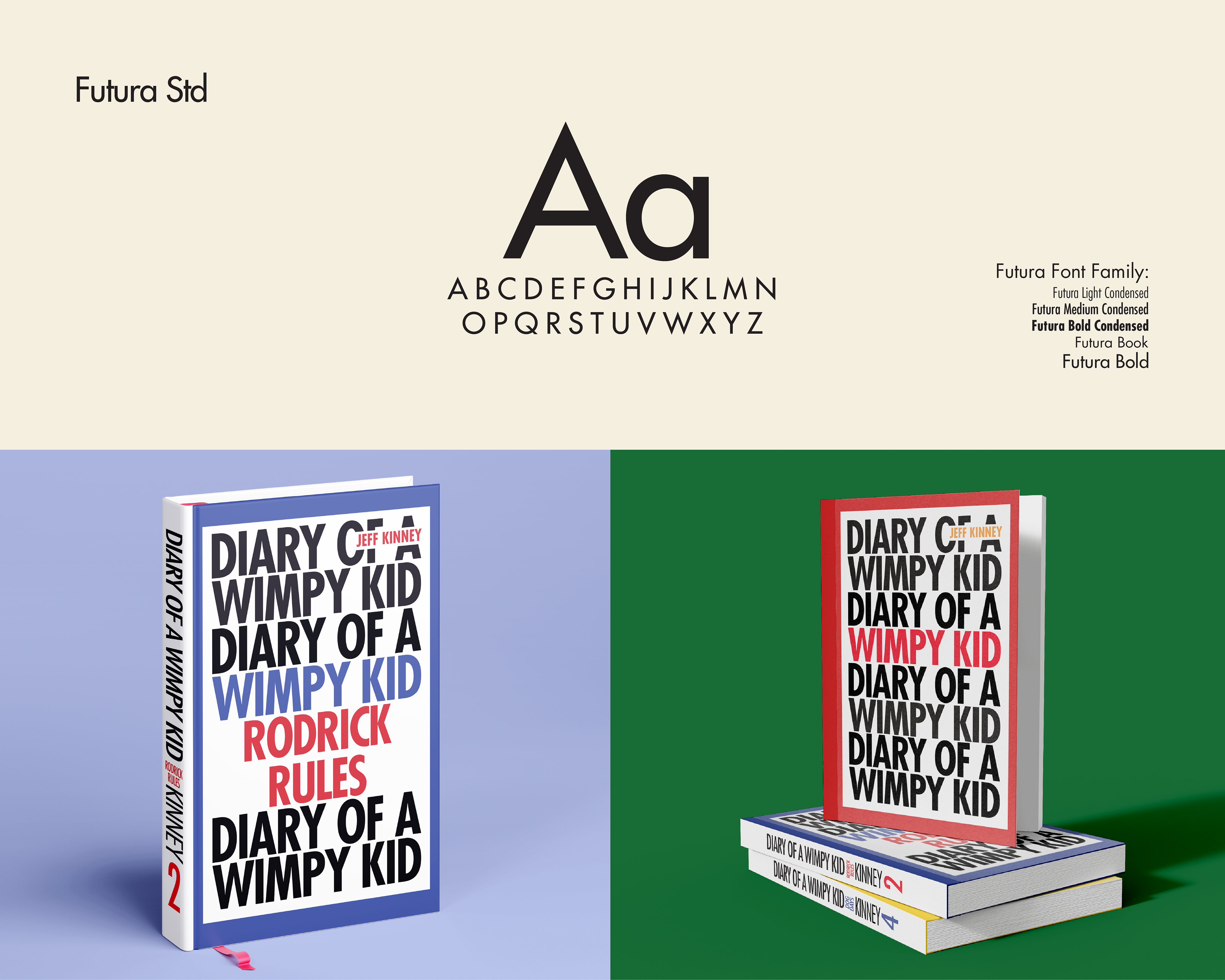
Tools: Adobe photoshop, Adobe Illustrator, Adobe Indesign
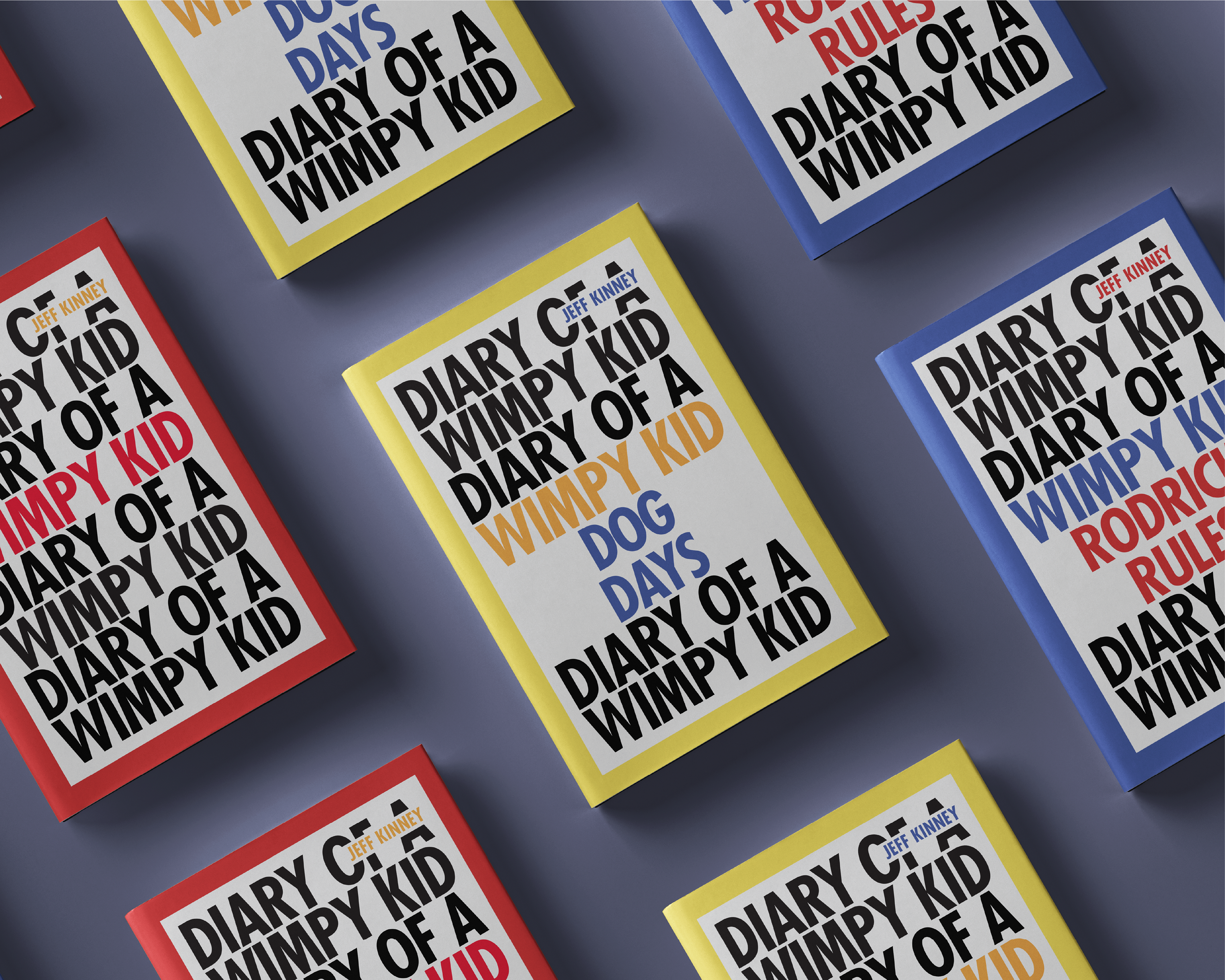
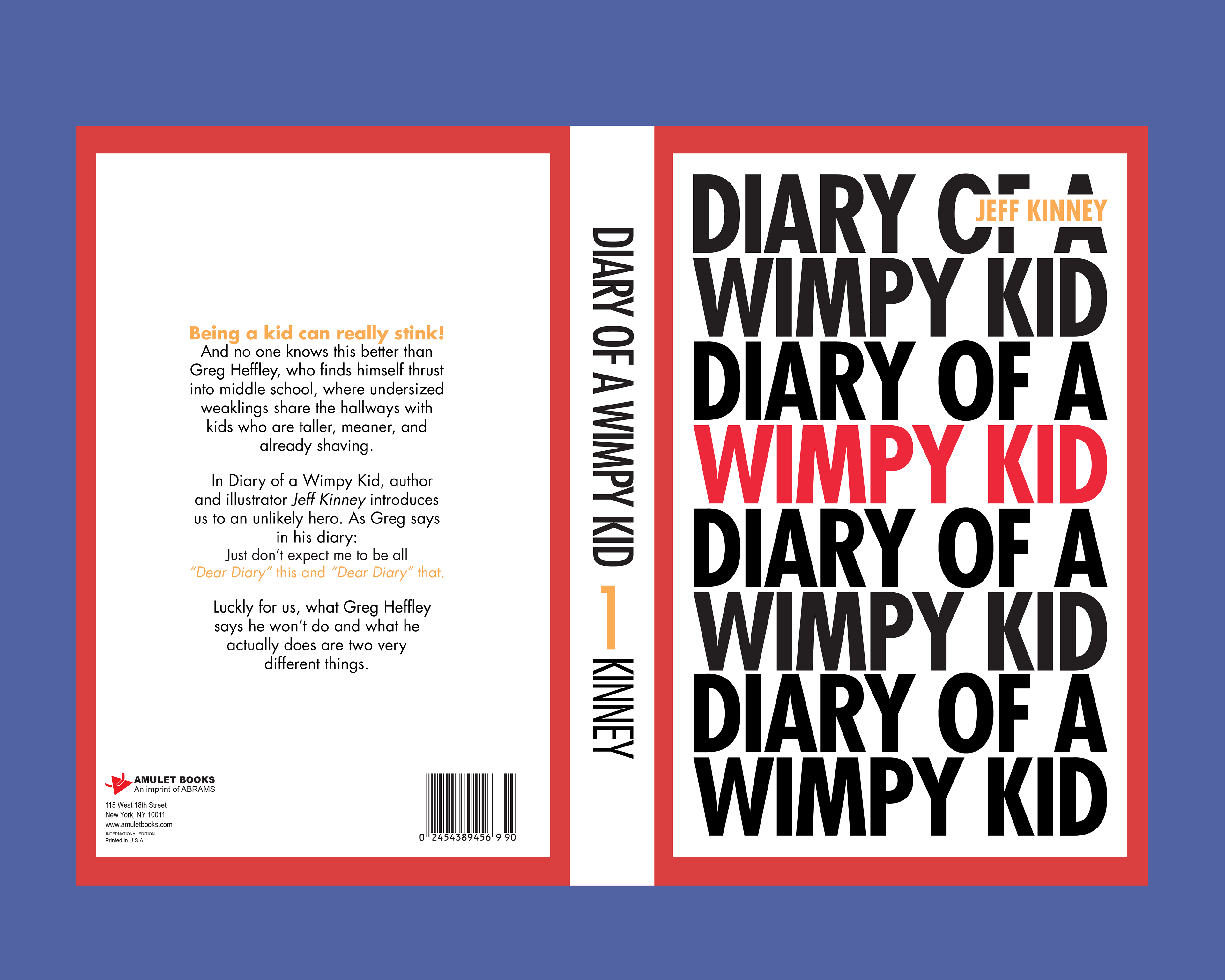
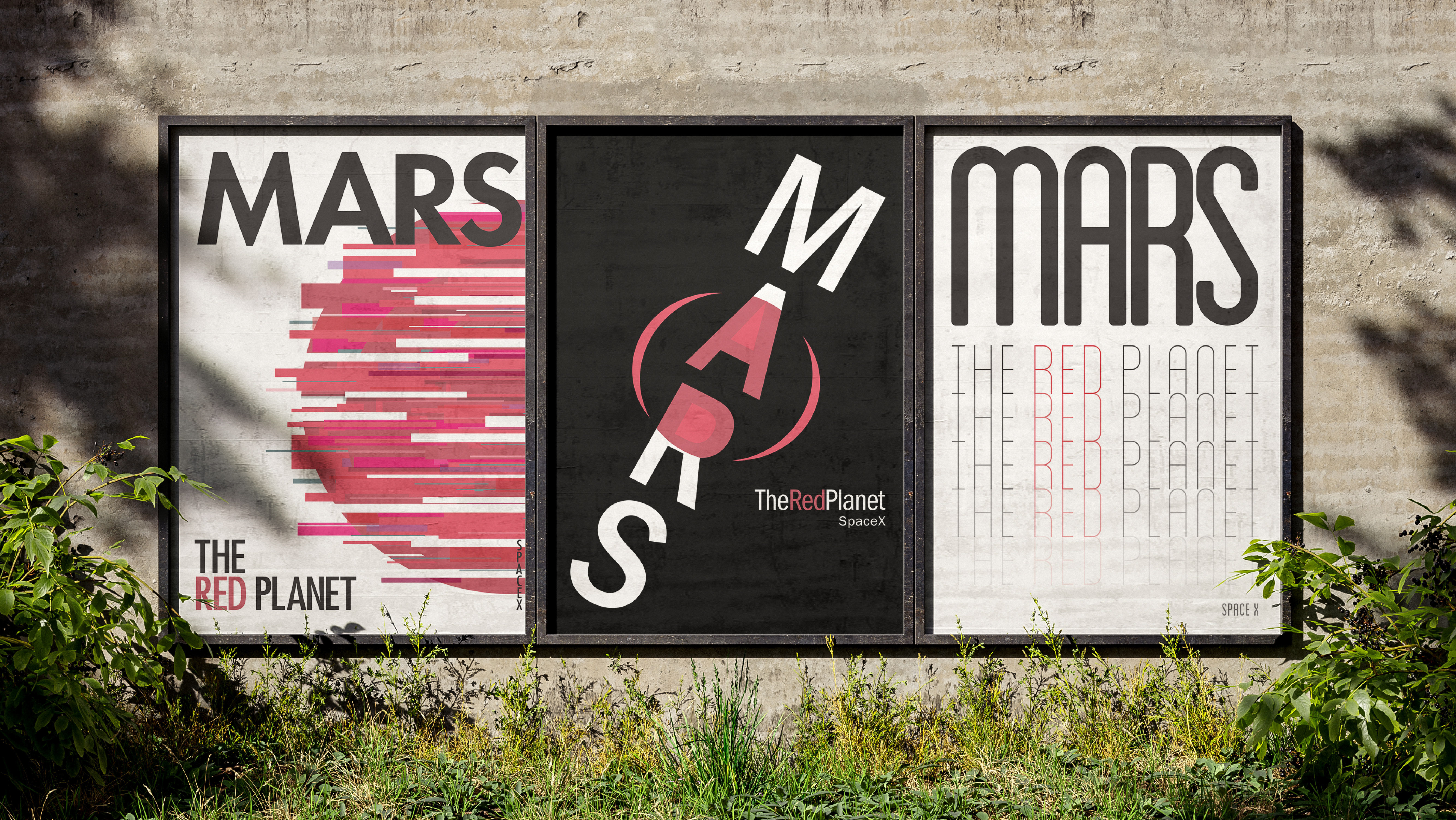
Diary of a Wimpy Kid by Jeff Kinney was the first book series I ever finished, making it the natural choice when I was challenged to redesign a book cover. Because the series has a massive visual identity through both books and film adaptations, I decided to take the complete opposite approach for this project. Instead of relying on the well known illustrations, I focused on a minimalist design that uses typography and color as the primary visual element.
Design Challenges: The goal was to redesign a beloved children's book to feel more mature. As kids grow into their pre-teen and teenage years, they often feel they have to reject the things they enjoyed as children, even if they still find them relatable. My challenge was to find a balance, creating a design that feels sophisticated and "grown-up" while still capturing the nostalgia and playful spirit of the original adolescent experience.
Solution: I developed a series of three minimalist book covers that replace traditional imagery with expressive typography. By focusing on the type, the covers take on a more mature, editorial aesthetic. To maintain a bridge to the original series, I kept the iconic color palettes associated with each book. This ensures that while the layout is new and modern, the brand remains instantly recognizable to fans of the series.
Result: The final result is a cohesive set of three book covers that offer a completely fresh perspective on the series. The system is visually unified across all titles and demonstrates how a brand can evolve to grow alongside its audience while maintaining a clear and readable visual language.